
The Financial Times on the art of craft beer cans
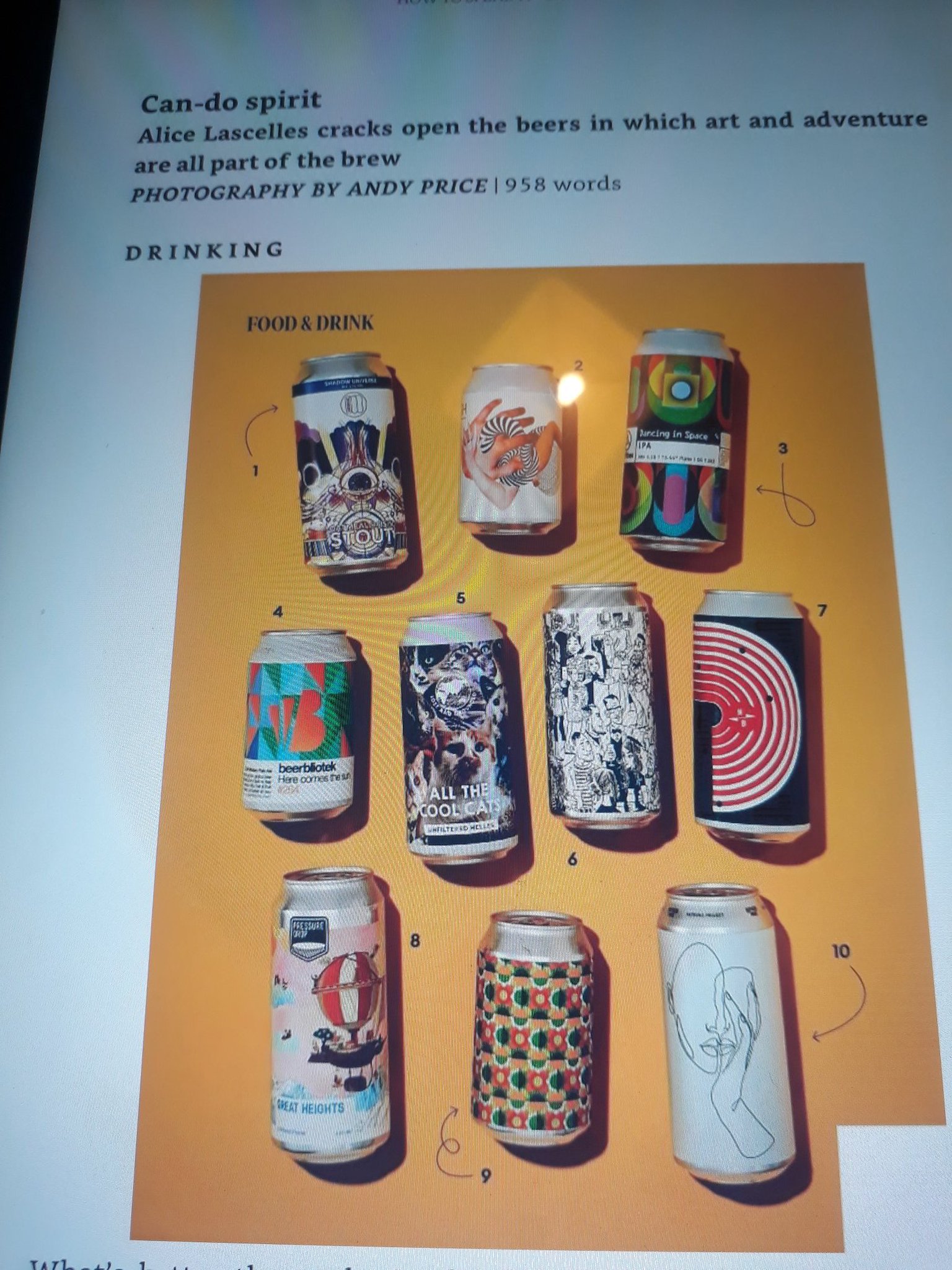
I’m a long term subscriber to the Financial Times and I was interested to see a piece by Alice Lascelles in the Saturday How to Spend It supplement on the art of craft beer cans. The FT more usually goes on about wine.
I should perhaps mention that I read the FT not because I’m an ardent capitalist but because I’m a socialist and the paper (unlike pretty much all others) still mostly reports accurately on the affairs of capital. Being a trade union officer in the City of London it also helps to know what the other side are up to. That’s what the other side think too btw as the Sainsbury’s right by the Stock Exchange HQ in the City always has a pile of Morning Stars first thing in the morning.
Anyway, the beer.
Many people who drink ‘craft’ beer in cans will be well aware that image is a part of the thing and that has led in recent years to a proliferation of interesting designs on beer cans. Nick Dwyer at Beavertown built a whole brewery image largely on bottle and then can design.
Certainly with the larger 440ml cans the label usually peels off and can be displayed and there have been deliberate projects to match art designs and beers.
There are limits. The FT piece which references can designs from the likes of Lost and Grounded, Pressure Drop and Burning Sky argues that it is a new development on what used to be 12 inch vinyl record sleeves.
Indeed but I’d no more buy a can of beer for the design than I would have bought an album of shit music for the cover.
I suppose the logic is meant to be good design, good product.
I suppose too its good to see the FT encouraging readers to buy craft beer cans on-line in days like these but the thought occurs that their readership will be amongst those still able to afford them in a years time…


Leave a Reply