
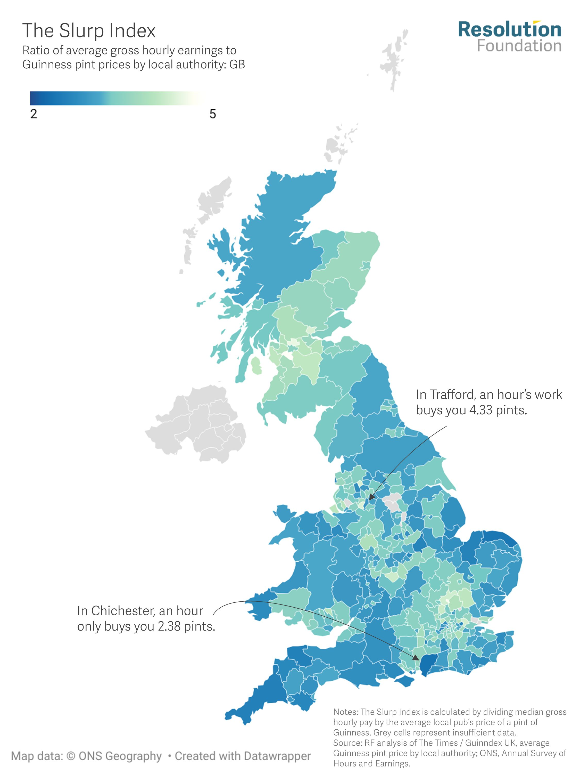
The above graphic is from the Resolution Foundation. It combines data on average hourly wages around the UK with the price of a pint of Guinness. The darker areas of the chart represent places where your money gets you fewer pints.
Of course there is always Wetherspoons which mostly will be selling a cheaper if not the cheapest pint of Guinness in a particular area.
Given the growing popularity not just of Guinness but of dark beers in general it might be thought that it would be a subject of conversation in the May 7th local elections. Do candidates know how much a pint costs in the patch they are standing in, and do they know what the wage or salary levels are? They can probably do little to influence either (Council workers wages aside) but it should be really useful knowledge


Leave a comment